Guiding users through using their slow-injection pharmaceutical device
Alignment, Experience design, Interface design, and Interaction design for BD
Mobile
Motion Design
Visual Design
UX Design
Client
BD
Date
Q1 2018
Role
UX & Motion Design
Length
8 weeks
The Challenge

Create a cross-platform mobile app that guides a user, often with higher accessibility requirements, through the setup, pairing, application, and delivery of their medication by way of BD's new delivery device

Output

I created a fully documented high fidelity user flow, complete with animations. The animations were used to film a promotional video for the product announcement. Ultimately, our team built out the application and delivered it to the client.

Context

Individuals with illnesses like Multiple Sclerosis are sometimes prescribed a long-term medication that needs to be injected into the patient on a regular basis. BD is introducing a line of medication delivery products that adhere to the patient's body for the duration of the slow injection of the medication.The concept of an injection device that adheres to the patient's body is very new to patients. BD informed us that many of the people that will use this device are elderly people, many of whom have very little technical literacy. Also, most users will fear the device to some extent, especially the first time they apply it since they don't know what it will feel like to actually insert the integrated hypodermic needle.The team also had a rapidly approaching deadline. They intended to show a demo video of the product and app in use, and then have an initial version of the full product available to demo later on.

Team

I worked with a UX Architect to design the product, worked with our mobile development team to implement the designs, and also worked closely with the client to ensure proposed designs met their user's needs, and that their product was accurately reflected in the app.

Kickoff

Bryan and I walked into our first meeting with the BD team understanding the basic goal of the app: Make an app that pairs with the hardware device and helps the patient apply and deliver a drug. After presenting medium-fidelity wireframes after our first round of design iterations, we were surrounded by some perplexed and frustrated team members from the client-side.

In the conversation that followed, we learned more about our users than we had before any of the prior meetings.

  • We were designing for typically elderly patients, who largely do not have tons of experience operating their mobile devices, so the application needs to walk them through every step of the process.
  • The physical drug delivery device at a certain point in the process sticks the user with a needle, which is apparently a scary, stressful event.
  • Patients will be interacting with the product infrequently, with intervals ranging from two weeks between doses at the low end to 6 months between doses at the high end. This means that we cannot rely on repetition to train the users to understand any advanced capabilities of the application.

All of this new information meant that we had to change the app design from being primarily a utility to being a comforting, helpful medical process

Visual Design

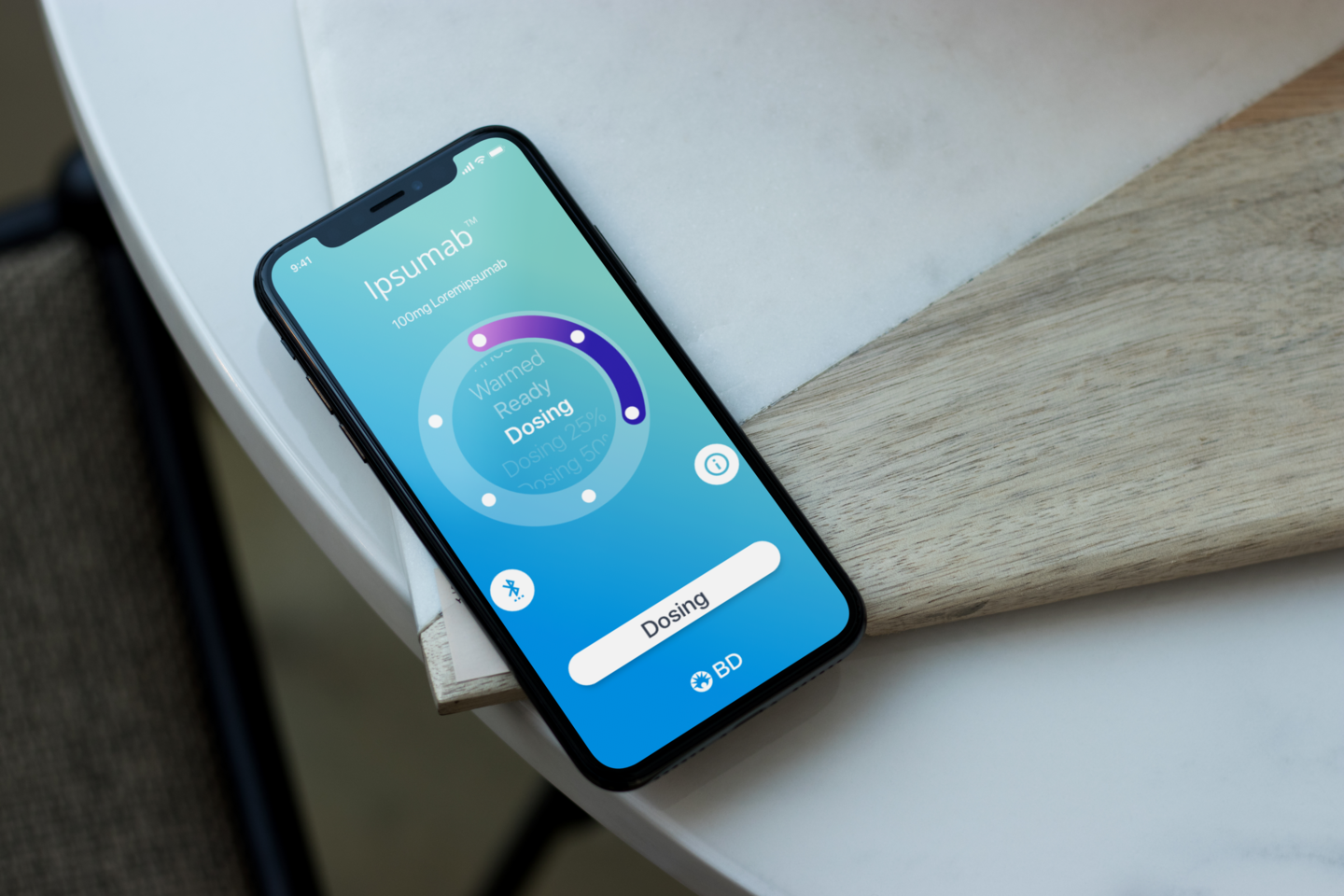
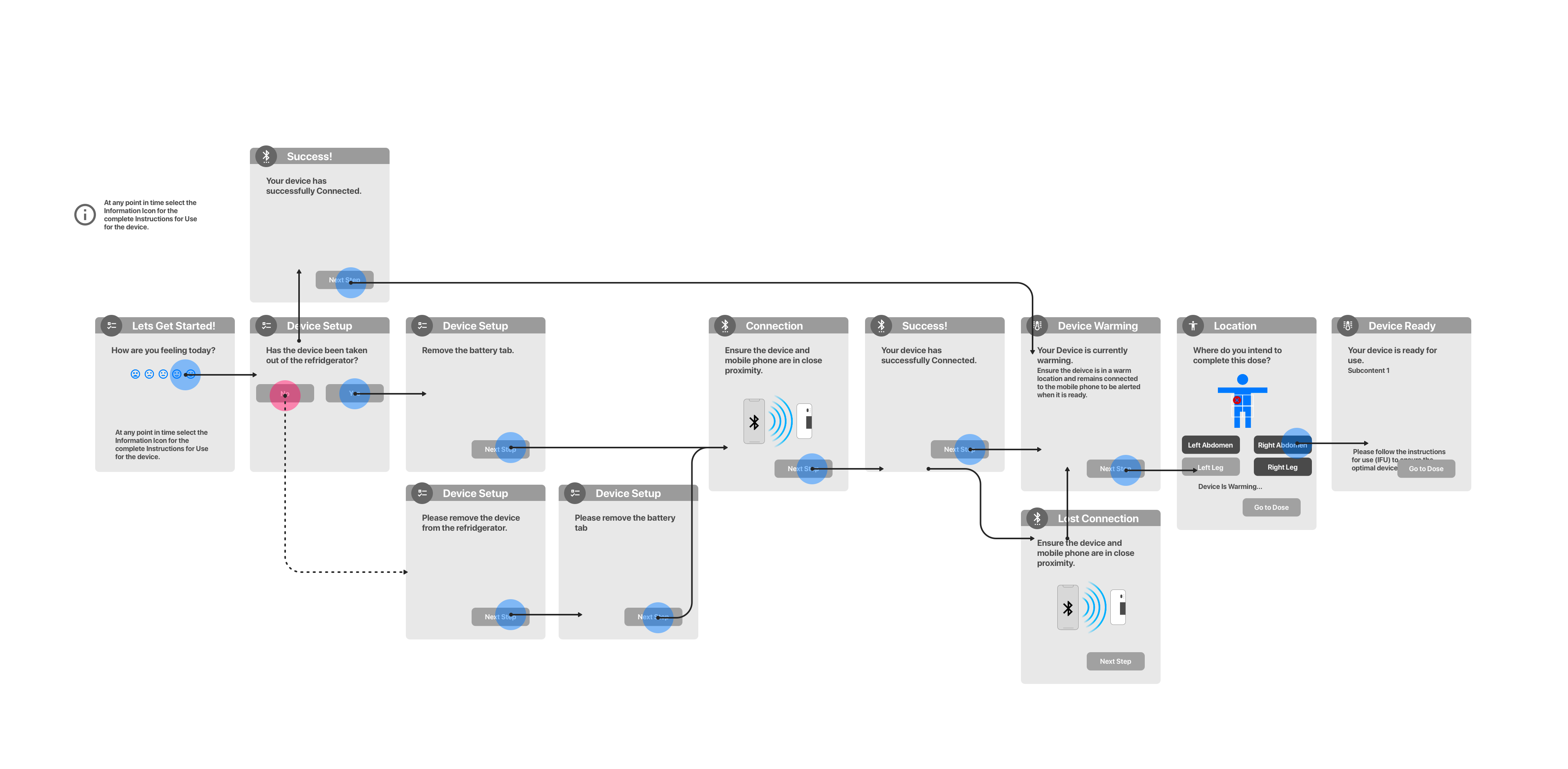
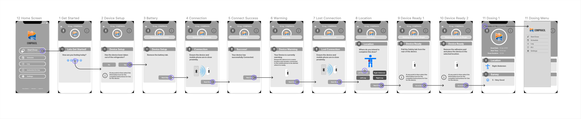
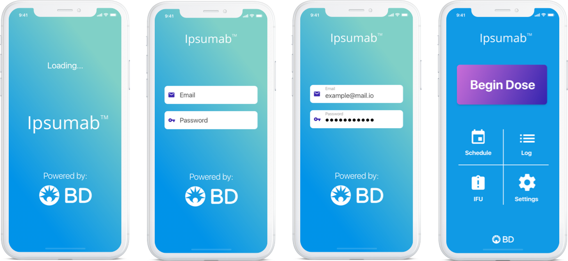
The overall emotional impact that we set out to create was to comfort our users. Once we had an understanding of the stress and anxiety that the patients were going to be experiencing with the injection, we adjusted the pacing and color palette to be as relaxed as possible.

Colors

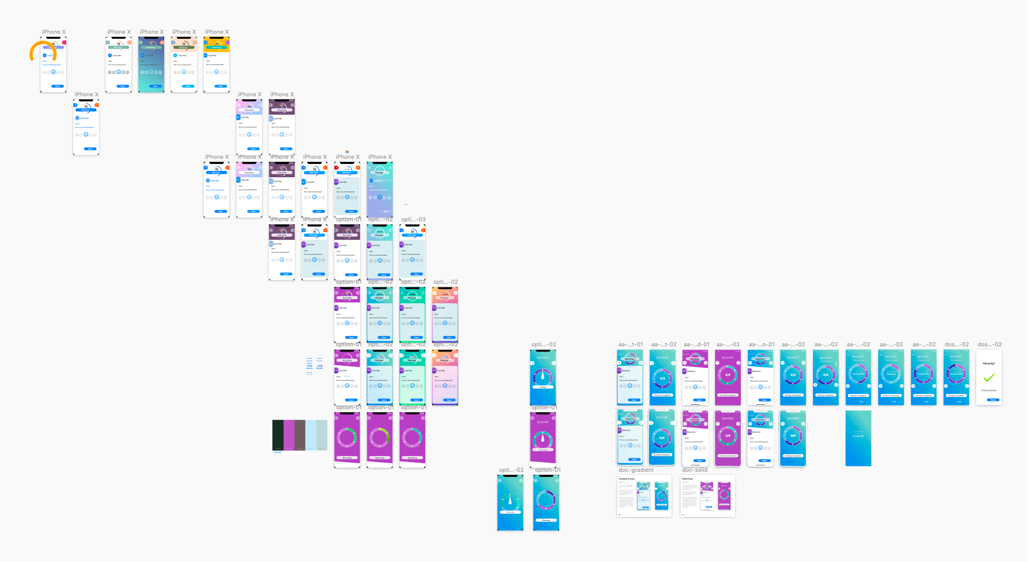
Relying on some color psychology, I based the color palette on the calming effects of blues and purples. These colors had the additional benefit of making it easy to create a UI with the color contrast necessary for patients with vision impairments to easily interact with the app.

I selected colors for the app with the goal of being accessible first and emotionally calming second. The blue gradient evokes the sky or the ocean to create a sense of calm within the screen but also retains the medical trust that is required for this type of app. It also provides a canvas to move the user through their process.

Indicators

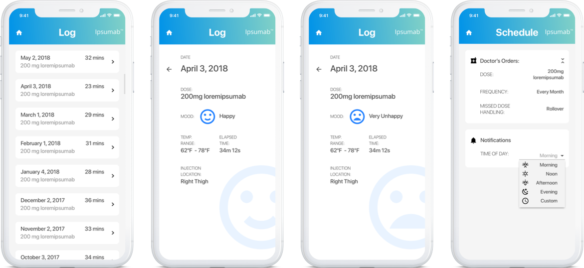
Larger icons, text labels, and clear language ensure that users won't be left wondering what a button does or if something is a button.

Interface Continuity through Motion Design

The whole app guides the user through a set of steps with a physical product and also attempts to gather data from them. For less technologically-literate people, this context switching adds difficulty and confusion. Therefore, it is essential to make sure users could see where they are in the primary process while they interact with information and enter data that is secondary to the process. Clear and smooth motion built into the design ensures that users don't lose their place by defining the relationship between the two priorities of the app.

On top of the user experience need to have motion designed as a core part of the application, the client also needed to film a short commercial for the device and the app working together well before the app had even begun development. I created a set of animations in Principle and operated them during the video shoot.

The animations below were created for the video shoot so that the actress in the scene would only have to tap the screen once. They begin on the final view in the process and on a tap, switch to the beginning of the flow where they proceed normally. The transition between the last to the first views are messy and created primarily to give the actress feedback that the animation will begin after a short pause.

Empty and Error States

Patients are already a bit on edge while they follow the app through their dose. One of the worst things we could do to our users is to leave them encountering errors that create extra stress and confusion. We put extra focus on handling the possible error states in a way that would act as a gentle and helpful notification.  

Likewise, helpful empty states are not only necessary in any user interface, but are especially important in this context where users are less likely to be experienced enough with their device to intuit the next steps of the process.

Beyond the Primary Flow
Splash Screen and Sign In

Before the user can start their injection, they have to sign in. This is also the first place the app begins to convey the branding and color treatment. The fourth screen here is the home screen, where you can see the effort to make all of the buttons as clear as possible.

Logs and Settings

The client emphasized the patient's need to be able to view their history with the drug. Logs will display the drug delivery statistics as well as any responses to survey questions.

So much of the macro-level interaction with the app is based on the prescription for a drug, so there are remarkably few settings.

Outcome

The app was developed and deployed in time for BD to show off their full product offering for the whole solution at an important conference for their market. They reported back to us enthusiastic that people reacted positively to the product, but even more so, to the app. The product owner at BD told us he will be coming directly to us to white label the tool when a pharmaceutical company buys the rights to it.

© 2023 Gary Meyer. All right reserved.